We've been asked to do background and character layouts for a shot from our storyboard, which, so far as I can tell, mainly means focusing our time on one particular piece of presentation storyboard work.
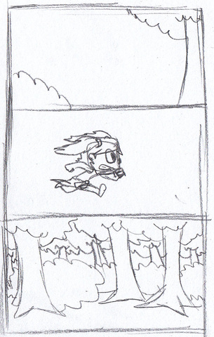
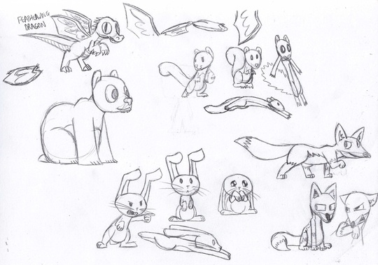
My first thought was to focus on shot 2, because that had the most interesting scenery layout, because some of it is in front of some parts of the screen the character passes through, so you'd have something slightly interesting with dealing with that.
My first thought was to focus on shot 2, because that had the most interesting scenery layout, because some of it is in front of some parts of the screen the character passes through, so you'd have something slightly interesting with dealing with that.
So here, I was thinking about what layers went on top of what.
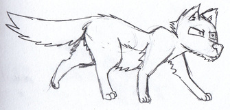
But then I heard we were supposed to pick a shot that had both characters in it. I figured the most interesting poses when both characters are on screen were on the 2nd panel of shot 11, and so doodled that. I didn't order the images in terms of what their layering would be, but fixing it felt unnecessary as it seemed fairly obvious that the characters would be in front.
But then I heard we were supposed to pick a shot that had both characters in it. I figured the most interesting poses when both characters are on screen were on the 2nd panel of shot 11, and so doodled that. I didn't order the images in terms of what their layering would be, but fixing it felt unnecessary as it seemed fairly obvious that the characters would be in front.
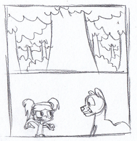
The issue I have is that neither of these shots really does anything especially interesting with both elements - backgrounds and characters. Shot 2 has the issues with environment layering, and Shot 11 has the character expressiveness.
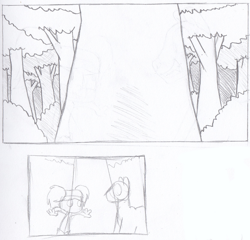
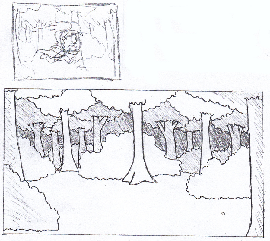
I'm still unsure which one I want to go with, so drawing up a detailed pencil draft of the backgrounds, I decided to try both:
I'm still unsure which one I want to go with, so drawing up a detailed pencil draft of the backgrounds, I decided to try both:
 RSS Feed